By Ceci Cook
The colors you choose for your home do more than set a visual tone — they shape how every room feels to live in. Color psychology, the study of how hues affect mood and behavior, has long been a core tool for interior designers, and it translates just as powerfully in a personal home as it does in any professionally designed space. In Healdsburg, where the landscape itself offers a masterclass in warm golds, deep greens, and soft terracottas, the principles of color psychology map naturally onto how Wine Country homes are designed and lived in. Here's how to use them intentionally.
Key Takeaways
- Every color carries a psychological effect — intentional choices make rooms feel better to live in
- Warm and earthy tones are a natural fit for Healdsburg homes and the Wine Country lifestyle
- Different rooms call for different palettes based on how you use the space
- The 60-30-10 rule is a reliable framework for balancing color without overwhelming a room
Start with How You Want Each Room to Feel
Before picking a paint color, think about the experience you want in each space. A bedroom calls for something different than a kitchen, and a home office has different needs than a dining room designed for entertaining. Color psychology gives you a framework for making those decisions intentionally rather than by guessing.
Cool tones — soft blues, sage greens, muted lavenders — tend to calm the nervous system and slow the pace of a room. They work well in bedrooms, bathrooms, and reading spaces where relaxation is the goal. Warm tones — terracotta, ochre, warm white, deep red — energize and invite connection, making them a natural fit for kitchens, dining rooms, and living spaces where people gather.
Room-by-Room Color Guide
- Bedroom: Soft blues, dusty sage, warm white, or muted greens — colors that support rest
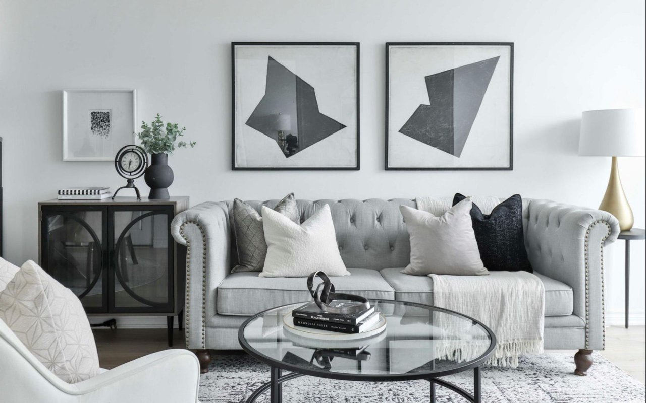
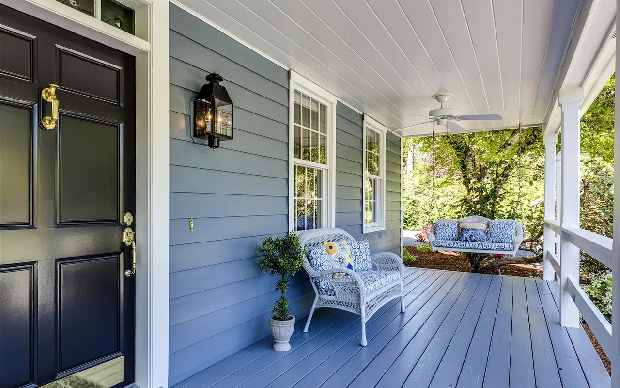
- Living room: Warm neutrals, terracotta, earthy greens — colors that invite gathering and warmth
- Kitchen: Warm whites, soft yellows, or light greens — colors that feel fresh and energizing
- Home office: Deep navy, forest green, or muted gold — colors that support focus without being sterile
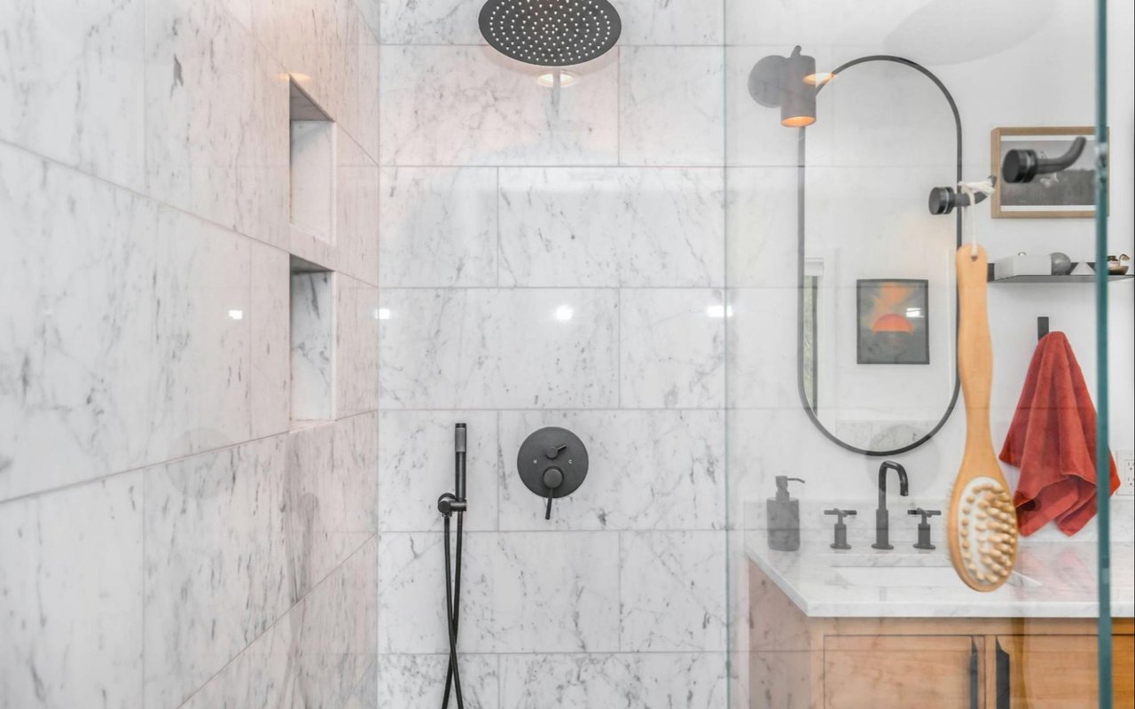
- Bathroom: Soft blues, pale aqua, or crisp white — colors that feel clean and restorative
The Wine Country Color Palette
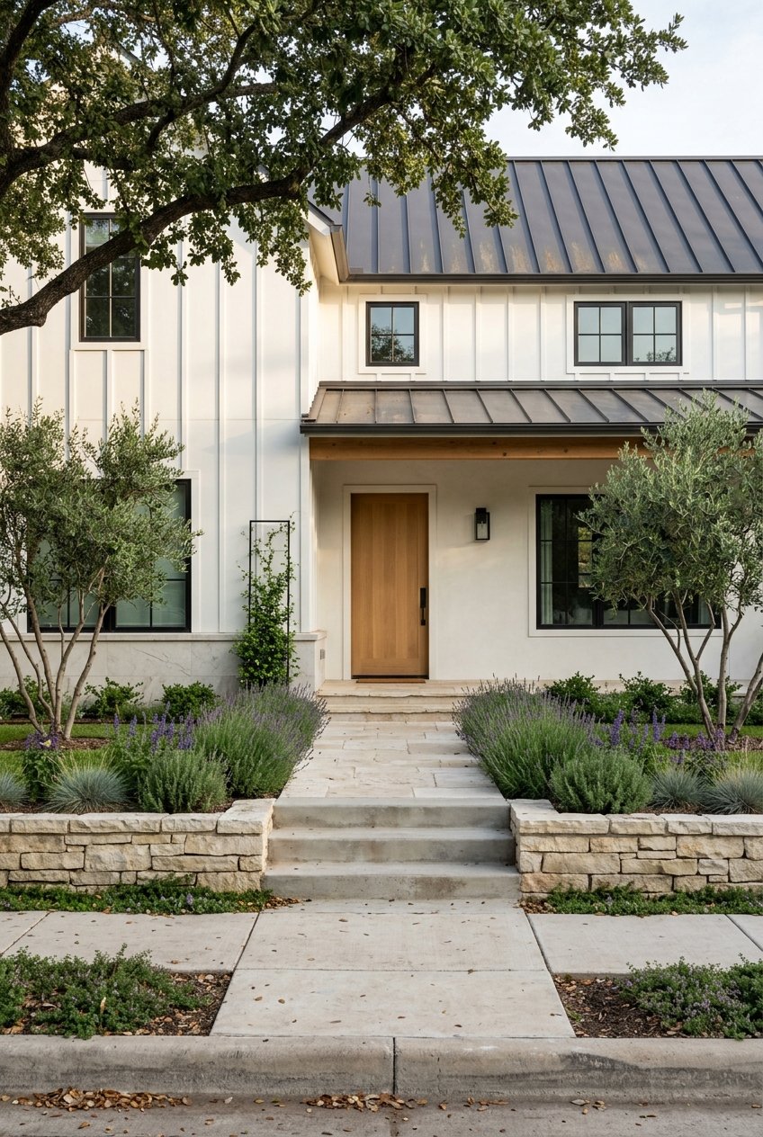
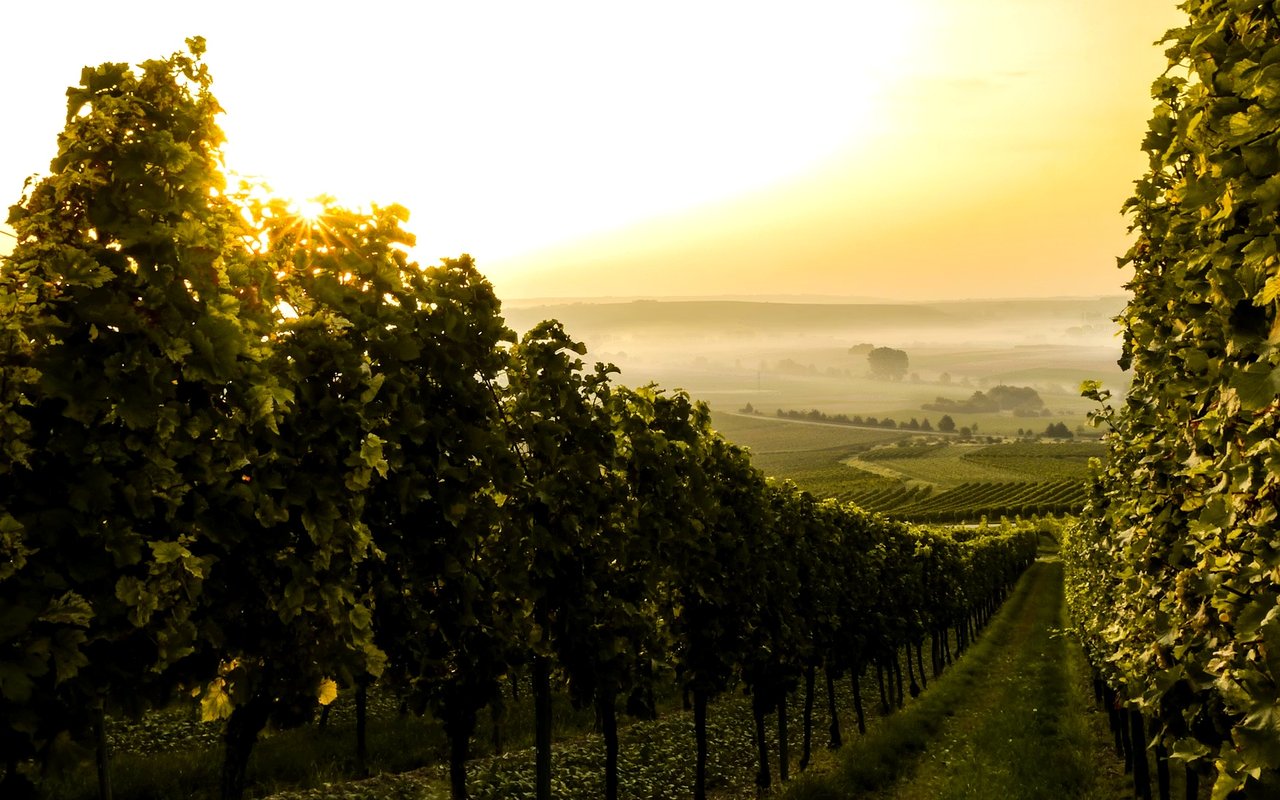
Healdsburg and the broader Sonoma wine country landscape offer some of the most naturally beautiful color reference points available. The rolling vineyards in fall, the golden hills in summer, the deep greens of the redwoods to the west — these are colors that feel at home here because they are home here.
Earthy tones like terracotta, warm ochre, olive green, and weathered wood brown translate this landscape into the interior. They create the warm, grounded quality that Wine Country homes are known for, whether you're working with a historic downtown Victorian, a newer build in a hillside neighborhood, or a ranch-style property on the outskirts of town.
Colors That Work Especially Well in Healdsburg Homes
- Terracotta and clay — warm, sun-baked tones that echo the vineyard landscape
- Olive and sage green — earthy and calming, connecting interiors to the natural surroundings
- Warm white and cream — clean without being cold, letting natural light do the work
- Deep wine and burgundy — rich accent tones that reference the region's viticultural character
- Warm wood tones and natural stone as anchors for any palette
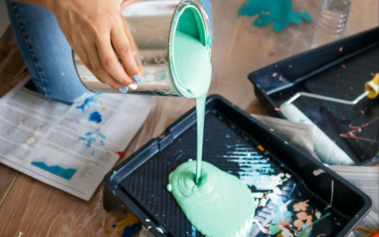
Use the 60-30-10 Rule for Balance
One of the most reliable frameworks in interior color design is the 60-30-10 rule. It gives any room a sense of visual balance without requiring a design degree to execute. The dominant color — typically walls, large upholstered pieces, or flooring — accounts for roughly 60 percent of the visual field. A secondary color in furniture or textiles takes up about 30 percent. An accent color in artwork, throw pillows, ceramics, or small decorative objects handles the remaining 10 percent.
In practice, this might look like warm white walls and a natural linen sofa as the dominant palette, a sage green area rug and accent chairs as the secondary layer, and terracotta ceramics or a deep burgundy throw as the accent. The proportions prevent any single color from overwhelming the space and give each hue room to do its job.
How to Apply the 60-30-10 Rule
- Choose your dominant color first — it sets the entire room's emotional tone
- Select a secondary color that complements rather than competes
- Use your accent color sparingly but deliberately — it's where personality comes through
- Test paint samples in natural light before committing, especially in north-facing rooms
- Use texture — linen, wood, stone, ceramic — to add depth within a single color family
Think Beyond Paint
Color psychology in the home isn't only about wall color. Furniture upholstery, textiles, artwork, flooring, and even the plants you bring inside all contribute to the color experience of a room. A space painted entirely in warm white can still feel cold if the furniture is all black metal and the floors are gray tile. Conversely, a neutral room can feel rich and warm with the right layering of natural textures and earthy accent tones.
In Healdsburg homes, this often shows up in the mix of reclaimed wood, natural stone, woven textiles, and handmade ceramics that characterize the Wine Country aesthetic — materials that carry their own earthy palette without a drop of paint.
Ways to Add Color Without Repainting
- Layer in warm-toned textiles — linen, wool, jute, or woven cotton throws and rugs
- Bring in living plants, which introduce green and contribute to a sense of calm and connection
- Use artwork intentionally — a single large piece can anchor a room's entire palette
- Swap out throw pillows or decorative ceramics between seasons for easy palette shifts
- Choose warm-toned light fixtures and bulbs, which shift a room's color temperature significantly
Does color really affect mood at home?
Yes — and it does so in ways that are hard to ignore once you become aware of them. Soft blues and greens genuinely slow the pace of a room and support rest. Warm, earthy tones encourage connection and comfort. Bold colors like deep red or saturated yellow increase energy and stimulation, which is why they tend to work better as accents than as wall colors in rooms where you want to relax.
How do I choose a color palette if I'm not sure where to start?
Start outside. Look at the landscape around your home and identify the tones that feel most natural to you — the colors of the hillsides, the vineyard rows, the oak trees, the evening light. In Healdsburg, that palette tends toward warm neutrals, dusty greens, and terracotta. Bring those colors inside and build from there.
Does color choice affect a home's resale value?
It can. Neutral and warm palettes tend to photograph well and appeal to the widest range of buyers, which matters when it comes time to list. Bold or highly personal color choices can make a home feel harder to visualize for buyers who don't share the same taste. If you're thinking about selling in the near future, a warm neutral palette is usually the safest and most broadly appealing choice.
Ready to Make Your Healdsburg Home Work for You?
Whether you're refreshing your current space or searching for a new home in Wine Country, I'm here to help you think through every detail. Reach out to me,
Ceci Cook, and let's talk about your goals in Healdsburg.